A patient portal that makes heart health reports approachable and actionable.
Role
UX & Service Designer
Outcomes
Product launch, 10,000+ new users in 3 months
Teammates
1 Founder, 1 Design Lead, 1 Product Designer, 1 Graphic Designer, 2 Engineers
Duration
Aug - Dec 2023
Motivating preventive care through approachable and actionable heart health reports
Problem/ Upto 70% of adults at risk of heart disease underestimate their risk. This is alarming since heart disease can progress silently for years. Cardiovascular diseases are the leading cause of death worldwide, claiming over 19 million lives annually.
Opportunity/ The surprising fact is that 80% of these deaths are preventable through early interventions.
Service/ Endless Health addresses this public health concern and low awareness through accessible, accurate and affordable heart health screening and risk prediction using convenient blood testing through finger-prick tests which can be performed at-home or during mass-testing events.
Solution/ This project focuses on designing a web portal to deliver health reports to users. This portal serves as a crucial touchpoint in the user journey, helping people understand their risks and encouraging early interventions to prevent heart disease.
MY Contributions
-
Content design: worked with experts to make scientific information digestible and actionable
-
UX design: concept, wireframes, prototype, iterations
-
UX research: usability testing-1:1 interviews, behavior analytics

hypothesis
Making health reports educational can improve users’ understanding of long-term cardiovascular risk and motivate preventive action.
Testing the hypothesis/
We designed and developed a one-page prototype for initial testing. After launching it with a small group of users we gathered valuable feedback through 6 one-on-one user interviews and Hotjar behavior analytics (100+ sessions).

Deconstructing scientific information

Creating infographics

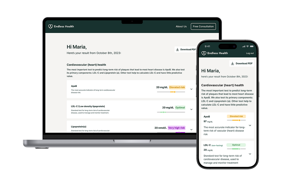
Feature: Explaining ApoB, a critical biomarker

Feature: Showing ApoB result and what it means

Prototype for testing
What we learned from users
Early prototyping and testing helped learn from our assumptions. Users felt overwhelmed by scientific facts and thought the information was not relatable. It would be better if the results were shared first—letting the users know where they stand—before providing educational information. The 3 key insights were—
1. Information feels overwhelming and not relatable
The idea of using science and facts as a way to motivate readers to take early preventive care conflicts with the user's expectation: seeing concise results. How can the information be better structured to meet both goals?
Where am I in all of this? This doesn't feel important to me until I know where I am.
...didn't realize this was my result at first.
...dont care about these facts because it doesn't change anything for me. I want to know how I can make it better when I'm at risk.
2. Feeling stressed and worried after viewing a negative report
There is a lack of emphasis on how users can improve their health and the immediate next-steps they should take. There is also a need to deliver negative reports more sensitively so users feel supported.
If somebody like me is seeing that I'm getting a bad result, I need to know that there are things I can do immediately.
At this point I thought I can do some thing, after this I realize I need to learn more.
I would say I'm not super old yet, right? Like so elevated risk is, is a scary term.
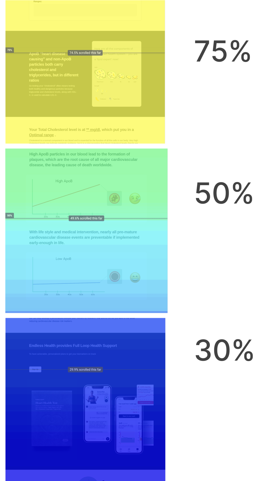
3. 50% of the users did not view half of the report
Users did not view the bottom half of the page including some of the test results and call for actions. How might we make the information more digestible and engaging?

reframed design statement
How might we design an educational health results portal that is concise and relatable to help users understand their long-term risks.
Solution/
1. Easy-to-interpret dashboard
From scattered and repetitive information to concise results without technical jargon


2. Engaging educational panel
From misconception to clarity through accurate, expert advised content


3. Reduced technical information by over 60%
From cognitive overload to clarity


4. Motivating users to take preventive action
From panic to feeling in control

Implement/
Design to launch
I helped bring the new concept to life by collaborating with the engineers to implement it and worked on related user touch points for the testing service including the mobile app, backend admin portal and the physical testing device.

Creating hand-off files

Creating the user flow for sign in/register

Designing related features for the admin portal

Contributing to the finger-prick test user journey

Designing related mobile app touch points
Conclusion/
what we achieved
Product launch, 10,000+ tests
In the first three months after product launch 10,000+ tests have been conducted nation-wide with the help of strategic partners to raise awareness about cardiovascular health risks.
Secured 4+ new partnerships
The new features were used in sales and investment pitches that led to partnerships with the Family Heart Foundation, Amgen, The American Society for Preventive Cardiology, and Black Heart Association.
18% longer session duration
Based on Hotjar behavior analytics we found improvement in user engagement as we continue to track design impact and iterate as needed.
learning and take-aways
A lot can be learned from testing assumptions
I used to think that designing with assumptions was a bad approach. However, in this project, due to a lack of time and budget for foundational research, we based our first iteration on assumptions (having experts from the field in our team was an advantage). Even though the assumptions were not accurate, prototyping early and quickly provided rich conversation starters during user interviews that led to valuable insights that ultimately helped us bridge the intent with user needs.
Holistic product thinking
Working in a dynamic start-up environment gave me an opportunity to think of solutions holistically, considering challenges related to tech feasibility and implementation of features across different platforms. Over time I found myself involved in product strategy as well as design execution. Supporting a successful product launch was one of the high points of this project.