Endless Health
UX & Content Design / 2023-24

Designing critical user touch points for a cardiovascular healthcare service motivating preventive care through accurate and accessible testing.

Cardiovascular diseases are the leading cause of death in the US. But 80% of the cases are preventable through early detection and care. Endless Health addresses this public health concern through a full-loop service: testing, tracking and training; that motivates early risk detection and preventive care.
Context
Type
Health-tech start-up
Growth stage
Role
UX Designer
UX Researcher
Scope
UX Research, Design Principles, Wireframes, Prototype, Content Design, Hand-off, QA
Team

Overview
Cardiovascular test and long-term risk prediction
Endless Health provides innovative, single-use test kits capable of assessing up to nine biomarkers, delivering highly accurate results on cardiovascular health and long-term risks.
These risks often go unnoticed until they become life-threatening. Recognizing the importance of early diagnosis and preventive care in tackling the public health crisis, Endless Health empowers organizations like the Family Heart Foundation, Amgen, and ASPS to conduct mass testing and screening campaigns, raising awareness and driving action for better health outcomes.

Mass testing event

Sample collection station

Using a self-test kit
Projects
Health results portal
Designing a webapp for viewing and understanding test results, while raising awareness about long-term risks of heart disease.
+ Content Design
+ Wireframing
+ User testing
+ Design strategy

Mobile app for preventive care
Guiding users with actionable and personalized steps to make scientifically backed lifestyle changes and help improve their heart health.
+ User flows
+ Hand-off
+ Edge cases
+ QA and app launch

Admin portal
Backend UX and UI design to manage end user profiles, coach profiles, front-end content and view analytics.
+ Gather requirements
+ Information architecture
+ User flows
+ Lo-fi and hi-fi prototypes

Research & development
Developing a new self-testing device; exploring AI-application to guide users with personalized lifestyle changes
+ Explorative research
+ Ideation

Case Study: Health result portal
OPPORTUNITY
Design a digital health portal to view blood test result, while raising awareness about long-term risks of cardiovascular diseases.
solution highlights
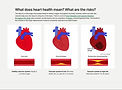
01. Interpretable Dashboard
Helps understand: What does heart health mean? What is my test result? What does my result mean?

02. Educational Content (Tackles misconceptions)
Breaks down concepts into basics and uses visualizations of internal organs to make the information relatable and engaging.

03. Actionable Guide
Provides tailored suggestions based on users' reports, empowering them to feel in control after viewing their results.


Role
contributions
Led UX research
Following an agile design process, our team built quick prototypes and refined it iteratively based on user feedback. I used heuristic analysis, behavior analytics and user testing that informed design decisions.
Established design principles
Based on the research synthesis, I established design principles to guide UX/UI design and align business and user needs.
Created wireframes
Having in-depth insights and contextual understanding, I proposed design improvements and new features with lo-fidelity mockups.
Led content strategy and design
One of the key interventions in the project was to make scientific information relatable and easy to understand. I led the content design and UX writing for the project.
Impact
60%
Lower task time
With new results dashboard and information redesign, users are able to view and interpret their results much faster, as indicated through user testing.
18%
Higher session duration
Users spent more time on the page; scroll and move data indicated high engagement for the educational sections in the portal.
4+
New partnerships
The updated design was a part of client presentations, and helped secure partnerships with leading organizations like Amgen, Family Heart Foundation, and more!
Design Process
Opportunity
How might we design a digital health portal for viewing and understanding test results, while raising awareness about long-term risks of heart disease?
Approach
1
Quick First Iteration
Brainstorming
Existing insights
2
User Testing
Behavior analytics
User Interviews
3
Expert Advice
Expert interviews
Technical research
4
Design Principles
Research synthesis
Design guideline
5
Final Design
Wireframes
Content Design
Process highlights
1. Quick First Iteration
The first iteration was based on Endless Health's goal to spread awareness about cardiovascular diseases. It utilized the founders' in-depth behavioral and scientific insights regarding cardiovascular disease causes and prevention.
Single page design for easy development
Due to limited time and team size, we decided to limit the first iteration to a single page design.
Making scientific and technical information digestible
One of the key tasks for the design team was simplifying complex information and making it engaging.

Deconstructing scientific information

Creating infographics

Prototype

Feature: Explaining ApoB, a critical biomarker for cardiovascualr health

Feature: Showing ApoB result and what it means
2. User Testing
A tangible prototype was beneficial to test assumptions early on, gain rich insights from users and inform further design direction with confidence.
Behavior analytics
Scroll, click and move data gave insight into what users paid attention or did not. It helped us learn where key information was skipped and where users wanted further details.
Usability testing (6 in-depth interviews)
One of the key tasks for the design team was simplifying complex information and making it engaging.


😕
Information is overwhelming
The idea of using science and facts as a way to motivate readers to take early preventive care conflicts with the user's expectation: seeing concise results. How can the information be better structured to meet both goals?
🤷♀️
Not relatable to "my case"
Science-backed information can help build trust and motivate users to take action. But it must be delivered in a more approachable and relatable way.


😥
I am worried and stressed after reading it
People found the information too much, they would not want to read that much and important bits of information are missed. This leaves them feeling out of control after seeing the results.
Data shows what users are interested in
Based on behavior analytics we learned that users expect certain elements to be interactive and the data suggests what users would be most interested in


50% of users did not view half of the report
50% of the users did not view the bottom half of the page including some of the test results and call for actions
3. Expert Interview
We shared our prototype and content with a cardiologist to ensure the information is accurate and in-line with the latest research and developments in the field.
Unstructured interview
We held a discussion with the cardiologist and got advice on how we might simplify the information to be digestible—how it can be concise and how it should be ordered.
4. Design Principles
Design principles are a way to synthesizing the research into actionable steps and they were helpful in:
Aligning our mission with user needs
After the exploration and research, we understood there was a gap between our initial idea and users' needs. Before redesigning we laid down some guiding principles.
Ensuring team alignment
Laying down the principles and discussing them among the team ensured team alignment.
1
Be concise and reduce congnitive overload
2
Facts must be relatable at a personal level
3
Leave viewers empowered to act and feel in control
5. Final Design
I designed the content, information hierarchy and wireframes for the final design.
Technical limitations and simple UI
The interface had to remain simple and easy to develop at this stage, as the product would be built incrementally.
Content design
A lot of my focus was on making scientific information easy to understand and engaging for the audience in order to have the impact we envisioned on public healthcare.
New results dashboard
Before:
Results were combined with educational information.
- Difficult to find
- Overlooked
- Seemed interactive

Now:
An interactive panel that highlights the result and provides further information about each biomarker and what it indicates about cardiovascular health.
+ Personalized
+ Interactive and intuitive
+ Concise
Redesigned educational content
Before:
Too many facts and figures.
- Overwhelming
- Not relatable
- Distracting

Now:
Concise information that is a starting point to understanding what cardiovascular health means and related risks to overall health and well being.
+ Digestible
+ Relatable
+ Engaging
A personalized summary
New feature:
Provides users an interpretation of the overall result by analyzing all biomarkers together and highlighting risks and concerns if any.
+ Actionable
+ Concise
+ Sensitive

Learning and Reflection
Worked in a dynamic start-up environment contributing to strategy as well as execution.
Learned to lead and manage UX research with limited resources
By adopting an agile process, I prioritized quick prototyping and early testing to improve the product iteratively, focusing on progress over perfection.
Bridging user needs with business goals
As the advocate for user needs in a cross-functional team, I played a key role in bridging user-centric design with business objectives. This often influenced major product decisions, ensuring a balance between user satisfaction and business success.
Considering technical feasibility during ideation and prototyping was important. Acknowledging tech limitations early ensured efficient and timely delivery of solutions.
Realized the importance of tech feasibility for successful and timely implementation
Recommendation
Harshi is a thoughtful designer who genuinely cares about the impact of her work... with her curiosity and proactive approach, she doesn’t just deliver on briefs—she seeks out ways to improve the product. Her insights helped drive the product forward, and her collaborative spirit made her a pleasure to work with.
- Cooper Galvin (Founder, Endless Health)